Morley’s Code


From sideshow performers to the Group of Seven, Katherine Morley’s ceramics are embedded with unexpected meaning
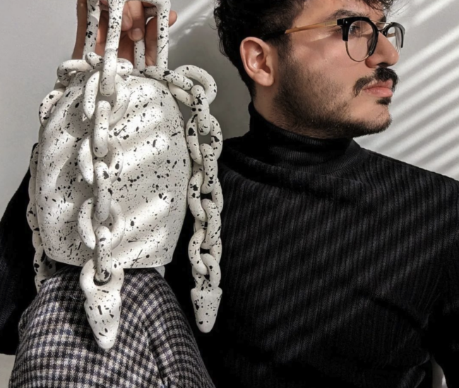
Katherine Morley darts around her Bathurst Street studio, pulling elegant white ceramic vases out of cardboard boxes and shuffling through loose bits of graph paper. Each item she shows me comes with a story that goes well beyond its function. Her Arctic Bookends, for instance, shaped like two jagged icebergs, are a nod to Lawren Harris, the Group of Seven painter who famously interpreted the Great White North’s icy peaks as cubist-like abstractions. But their forms are also meant to ignite a conversation about water conservation, Morley explains. In fact, some of the sales proceeds goes to the Lake Ontario Waterkeeper, a local NGO dedicated to cleaning up the Great Lakes. Two years ago, she created a quirky series of tableware items based on actual circus acts of a bygone era. Called Freaksware, the collection includes the famous Johnny Eck “half-boy,” who stands on the table on the palm of one hand (in the second hand is a candlestick) and salt and pepper shakers in the form of conjoined twins Daisy and Violet Hilton. Morley pored over documentation of freak show performers from the 1930s and ’40s to create her miniature versions all the while wryly noting the similarities between sideshow performances and reality TV programs popular today. The thought of creating a project without exploration or a cultural context doesn’t appear to be an option for Morley. “If you can’t look at your piece and justify why it exists,” she says of her various works, “then you’ve made something that doesn’t deserve to exist.” Of course, that doesn’t mean she’s not a sucker for beauty. Her studio is sprinkled with such functionless yet charming objects as ceramic dogs picked up at the Goodwill, a thimble-sized plastic pylon and a cluster of bride and groom wedding cake toppers. “I do have a weakness for cute things,” she admits with a grin. katherinemorley.com
Published in our Winter 2011 issue
Categories:
Local Act