‘Packaged Toronto’ Sees a National Identity Emerge in Manufactured Goods
Before Canada’s golden age of design, commercial artists in Toronto helped lay a foundation of beavers, mounties and maple leafs
Not without good reason, the postwar era of Canadian graphic design is seen as a golden age. The colourful, confident aesthetic that emerged then is still a readily apparent part of the visual fabric of everyday life. The CBC logo, the meandering Canadian National Railway logo and even our national flag are products of the era, but they didn’t emerge in a vacuum. They were the culmination of decades of creative work, much of it practiced right here in Toronto, and much of it overlooked.

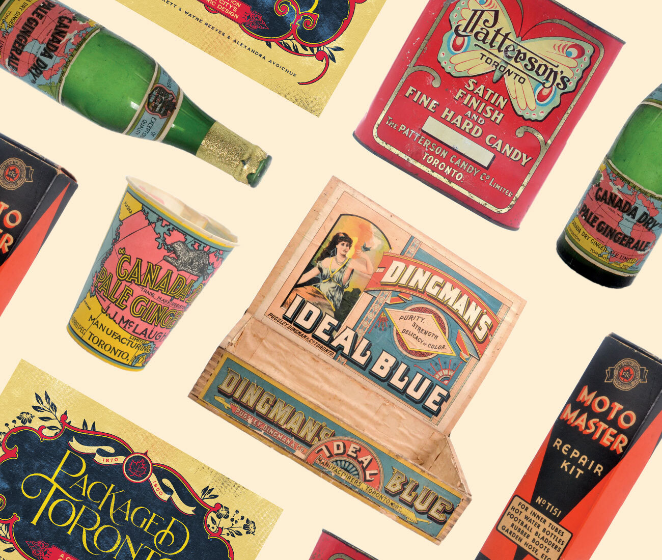
Consider Packaged Toronto a corrective, then. In it, authors Matthew Blackett, Wayne Reeves and Alexandra Avdichuk chronicle how Canadian design grew from its unfussy Victorian roots into something, well, Canadian. Trawling through the City of Toronto’s 150,000-object artifacts collection, Blackett and co. selected and photographed a huge range of goods, from unornamented liquor jugs to intricately decorated cookie tins dating from the 1890s to the 1950s, providing capsule histories of each. “There was history before the CN logo,” says Blackett. “They weren’t just British and European designers coming over here and taking over our design world. For the most part, we progressed ourselves.”

Contributed essays on graphic design history, typography, the era’s design process and Eaton’s packaging design get into the weeds of the subject (and are of huge interest to design nerds, which if you’re reading this, is you), but the broader story is one of Toronto and Canada growing out of its “branch plant mentality” – so-called by graphic designer Ron McDonald – and developing its own distinct style. A prewar educational board game made by the CBC features mounties and portaging, a tobacco tin features a beaver and, in an early example of national branding, a bottle of Canada Dry Ginger Ale from 1907 features a map of the country, which still adorns the brand’s labelling today. While the ‘60s is recognized as Canadian design’s golden age, the preceding decades saw a vernacular emerge amongst the country’s commercial artists that later designers drew from.

Amid the detailed descriptions of products and processes, Packaged Toronto is also rich in short, entertaining vignettes that shed a little more light on contemporaneous concerns. We learn, for example, that J.J. McLaughlin Manufacturing Chemists, which introduced Canada Dry Ginger Ale in 1904, suggested drinking their soft drinks instead of the city’s water since, amid water-borne typhoid epidemics, the latter wasn’t safe (sales soared). Toronto also did a bustling trade in patent medicine – a dubious racket if there ever was one – promising relief from arthritis, constipation and even tuberculosis.
Through all the ephemera, we get a snapshot of the city, one more finely tuned to everyday preoccupations and concerns than its architecture and fine art. We also get a look into the foundation of a visual style, one that long matured past its commercial intent to become part of our national identity. SPACINGSTORE.CA
Categories:
Arts & Culture