A Bay Street Condo Rescued from the Mid-2000s Blahs
Taylor Smyth turns a cookie-cutter condo into one with a lot of edge
Ingrid and Nesmith Chingcuanco aren’t the type to fret about a wall colour or agonize over a dozen sofas before settling. Function is the couple’s shared desire in a home. So after buying their first place, they arrived at their new Bay Street high-rise with nothing but a mattress. As an exercise before their condo renovation, the couple ghost-lived in the unit for three weeks (they still had their old place), searching for the places where their elbows knocked and the floorplan failed. It’s how they determined the master shower was too tight, the third bathroom’s inner self was clearly a laundry room, and the crowded eat-in kitchen would definitely need to open up.
Faced with mismatched flooring, French doors and turn-of-the-millennium lighting, the couple found themselves dreaming of a calm aesthetic and an honesty of materials – a holistic space in which everything from lighting to a place to put your keys was thoughtfully networked.

Enter Michael Taylor of Taylor Smyth Architects, who took one look at the non-load-bearing partition walls and popcorn ceilings and said “Scale it all back.” Beneath them, wide structural columns and bare concrete slab awaited, joining the wall-to-wall windows to create the perfect minimalist palette.

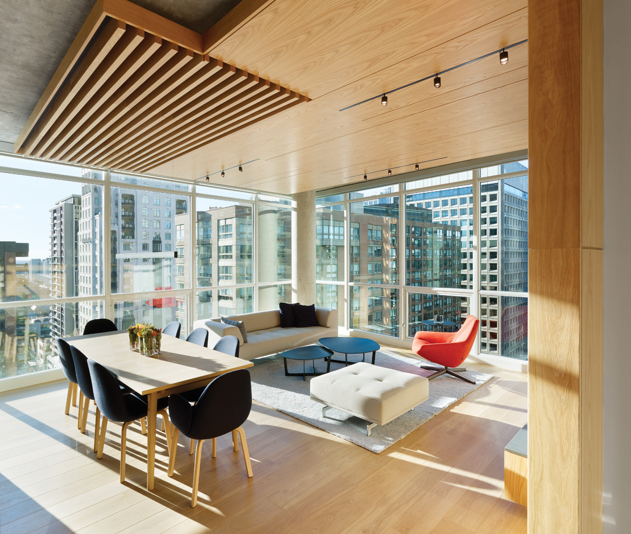
After the renovation, oak panels bring warm contrast to the condo’s industrial concrete. Wrapping walls and ceiling, the custom millwork imparts a sandy glow to the once-dark corridor that leads to the core of the now one-bedroom (plus den) unit. The hallway becomes open and functional, hiding closets, storage and the powder room. In the living room, a second oak envelope unites the entertainment unit and ceiling, with a special intervention above the dining table: a row of planks and voids that poetically defines the space as its own.
The two structures have a dialogue of scales with one another. As you walk in, the wrapped ceiling is slightly more intimate. Coming into the living room, where it’s higher, there’s a sense of release.” — Michael Taylor
More warmth is sneakily supplied by recessed perimeter lighting throughout, lending a lovely evening incandescence and accenting the track lighting built into the oak panels. Barely-there fixtures in the office and above the dining table complete the strategy. “One approach is to do something that’s a real feature above the table,” says Taylor. “But that would detract from the unity of the space. We went with something very minimal, the same aesthetic as everything else.”


And challenging the assumption that galley kitchens are cramped, a two-sided breakfast bar and parallel countertops are separated by what Taylor calls a “critical dimension” – allowing team cooking, spectatorship and room to mingle during a party.


As a renovation, it’s proof that 116 square metres in a condo can work as hard, functionally, as a storeyed home – with the right vision. Low-to-the-ground furnishings and select artworks round out the space: a splash of colour here, a hit of texture there. But generally, it’s the architecture that shines. As Taylor notes, “It’s a space that speaks for itself – you don’t need a lot of embellishments.”
Categories:
Spaces