How a Less-is-More Approach Opened Up This King West Victorian


Instead of using every potential square metre, this couple – with the help of architect Kyra Clarkson – opted for restraint
It’s a rare thing for new homeowners to do away with space. It’s rarer still for an expecting couple to do so. But while the benefits of more square metres are readily apparent – especially when there’s a new child on the way – a concise home edit has its merits, too.

Case in point, architect Kyra Clarkson’s reno of this Stafford Street Victorian. There was a lot to love about the home. It had good bones, high ceilings, a great location off of King West and a unique lot – more on that later – but the rear addition, which was slightly below grade and prone to flooding, wasn’t worth salvaging. “It was not a good space,” says Clarkson. “It would’ve been costly to rebuild.”

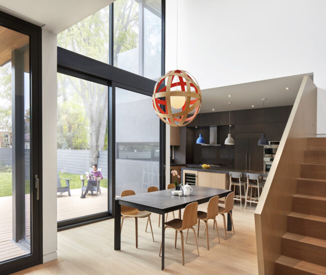
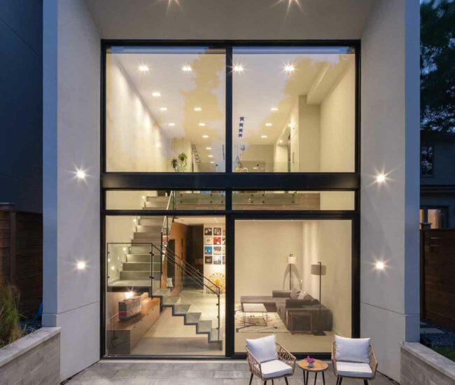
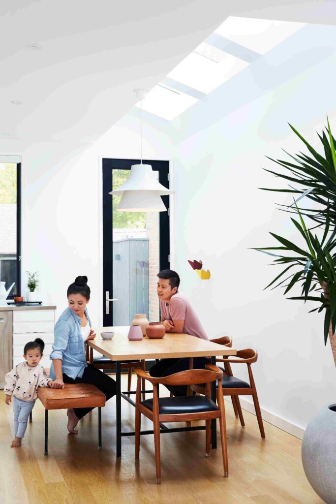
And so it went, cutting 21 square metres from the home. Instead, Clarkson and project manager Sheila Mathies appended a modest, single-storey addition off of its rear corner – complete with skylight – just large to make the kitchen an eat-in, then re-clad the side and back walls in white Maibec siding. The couple wanted an efficient, light-filled home, and were disciplined about making use of the available space. In keeping with that approach, they also decided against transforming the attic into a third storey. Could the home accommodate it? Yes, but between that and a soaring, atrium-like space above a floating, glass-walled stairwell, they chose the latter.

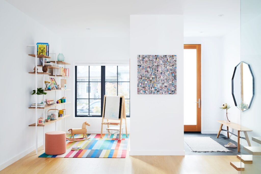
Rearranging the floor plan was critical toward realizing their goal, too. When they bought the home, the first floor had a familiar Toronto Victorian layout: a small entryway led to a narrow hallway and stairs, with the kitchen at the end and living and dining rooms off to the side. Clarkson removed the partitions and opened it all up, in one fell swoop creating more usable space while considerably increasing the amount of natural light. Instead of double doors, a new powder room and slate tile delineates the foyer. Upstairs, she rearranged the walls to increase available storage, while adding an ensuite bath to the main bedroom, a nursery and – a prescient decision before the pandemic – a home office.

The next step: build an entirely new home. Both sides of the property front onto an existing street, providing the opportunity for a laneway suite behind the freshly renoed one. And without the old addition in the way, both will have ample private outdoor space, which – as we’ve all learned – is exactly the kind of space that’s needed. KYRACLARKSONARCHITECT.CA

Categories:
Spaces
