A Study In Contrasts


How a client and a designer with wildly different visions reached their design détente
When Alison Milne met potential client Nick Morgan, he was wearing a suit and a toque. The tailoring she expected (he works in finance), but the toque? This should be interesting, she thought. Sure enough, he wanted to paint the inside of his semi-detached house on Shaw Street entirely black – even the ceiling.
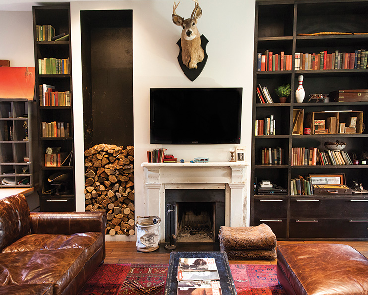
Morgan equates dark with comfort, and comfort topped his priority list. Partial to worn objects, the Bay Streeter wanted to leave work, shut the door on the TSX, and relax in an interior that evoked his heritage. Morgan’s brief suggested an English library, complete with cozy nooks, worn-in sofas and sooty fireplaces, and filled with antiques and collectibles.

Milne is Morgan’s opposite: curator of her own art gallery, as well as an interior designer, she favours white walls, clean lines and natural light. Unlike Morgan, who regularly shops at the Aberfoyle Antique Market in Guelph, she can’t stand clutter – not even throw pillows. Morgan’s challenge nevertheless intrigued her. But before she accepted, she insisted on a modern interior and refused to paint him into a bat cave.

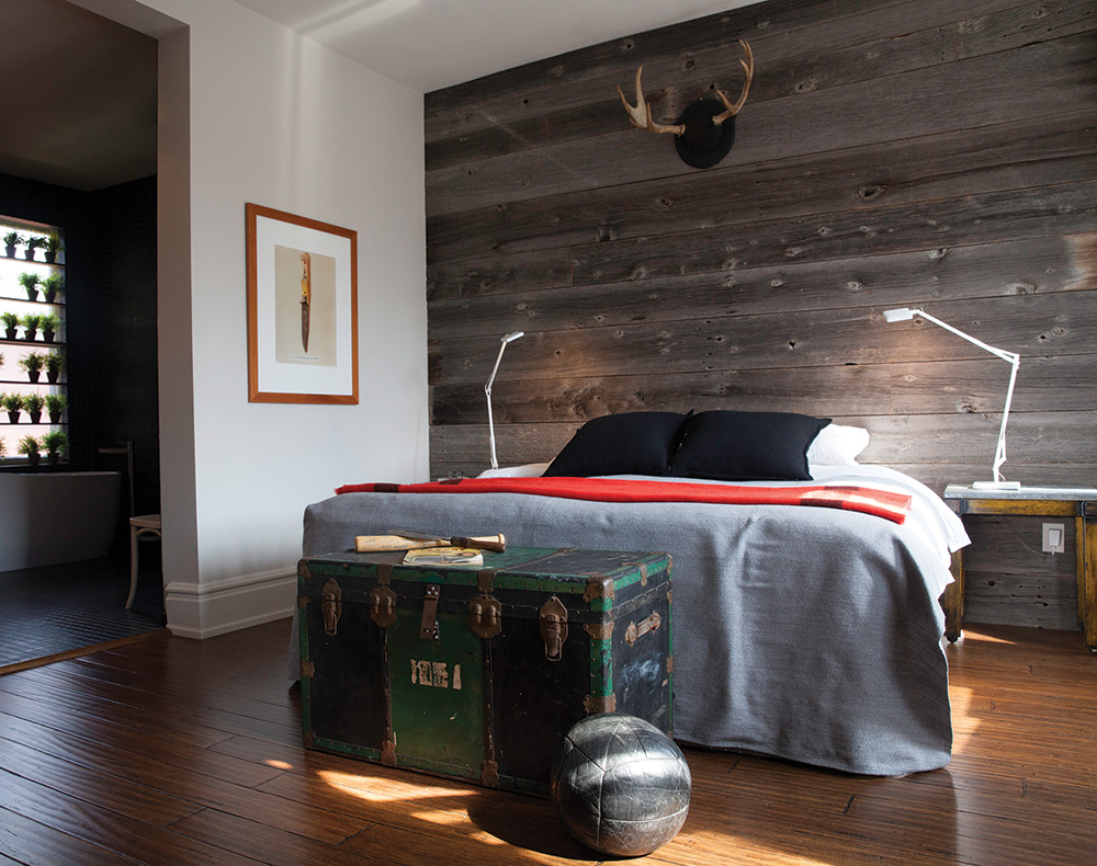
Morgan wanted his home’s weathered facade to serve as a foil to its deliberate interior, so Milne didn’t touch it. Past the threshold, however, evidence of client–designer compromise is everywhere. Milne ran walnut-inspired bamboo flooring throughout, to draw the eye from the foyer to the garden, and installed floor-to-ceiling shelving units in the living room to house Morgan’s assorted collections. He achieved a triumph of sorts with an old mantel and a deep, distressed leather sofa. Milne only scored one white accent wall and a few pot lights.

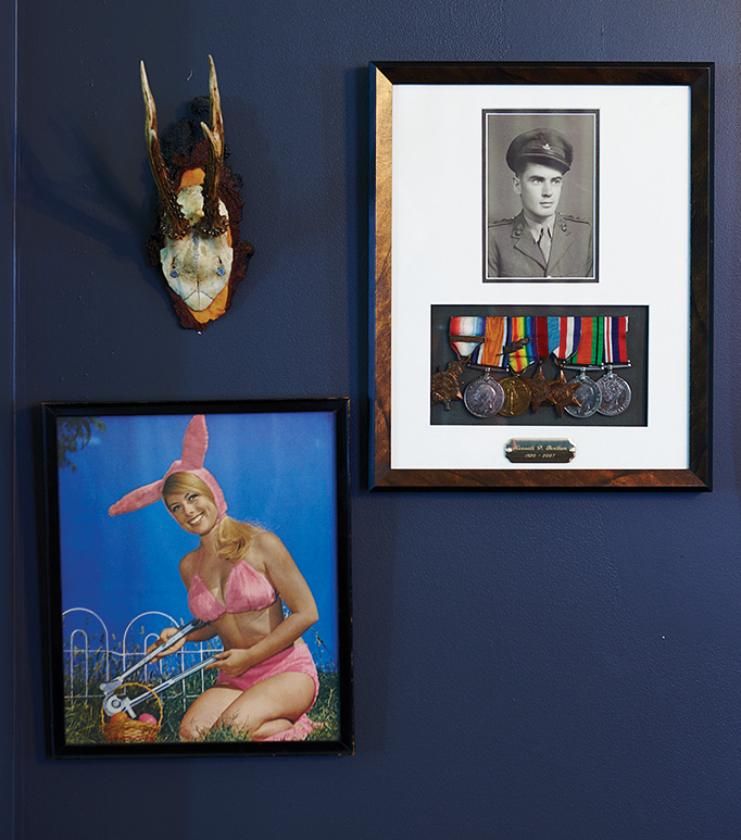
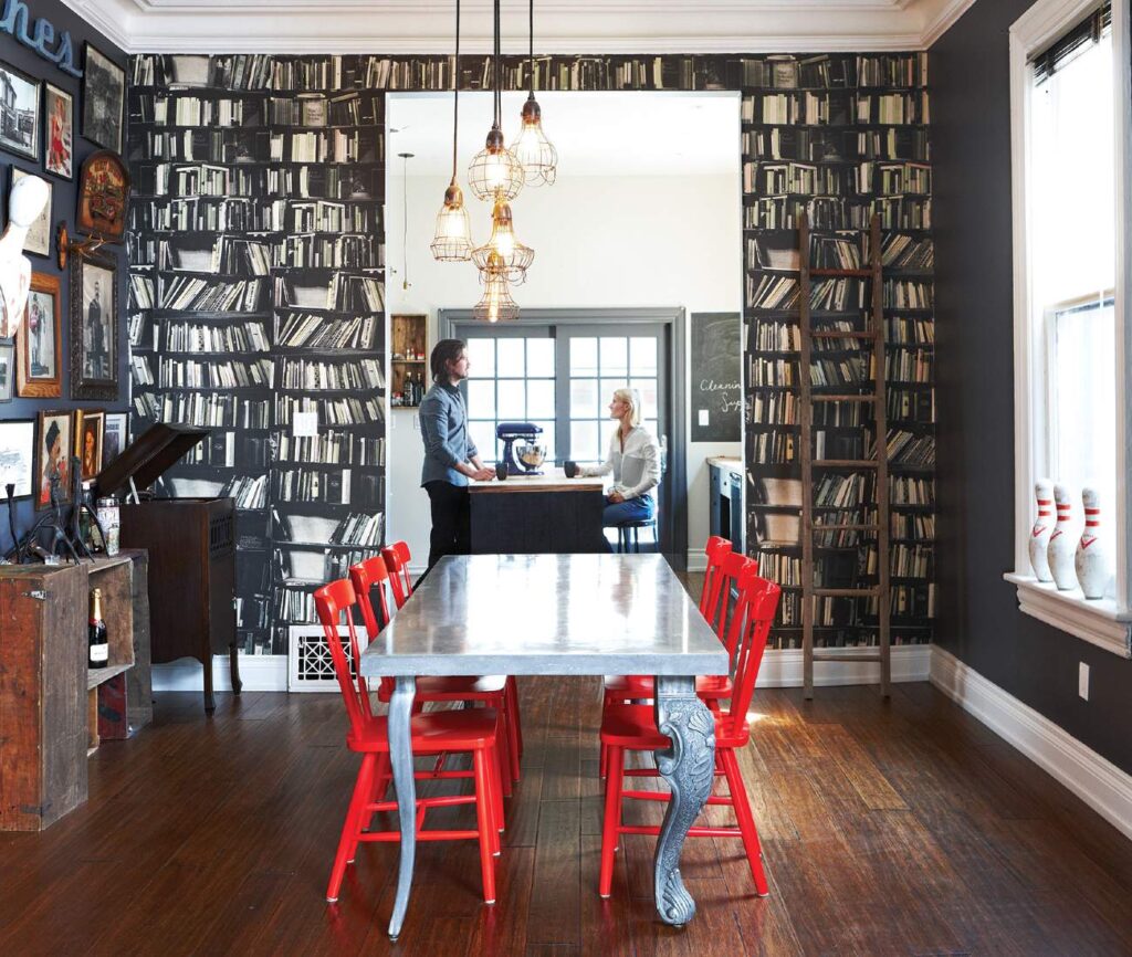
An actual library gives way to a wallpapered trompe l’oeil version in the dining room, buttressed by a salon-style arrangement of antique signs and framed family keepsakes. Hits of yellow and red – and Edison-style pendants – punctuate the black and grey wall treatments.
In the kitchen, Milne suggested white subway tile to offset the dark wooden cabinetry that Morgan had spec’d. He agreed on one condition: dark grout. The dirt-proof solution lends a graphic touch to an otherwise pristine space. Milne had the wooden countertops and cabinetry burned and dinged to give them an old-timey look, and a fully glazed wall – with views to Morgan’s vintage motorcycles in the garage – lets in natural light. Another win-win.
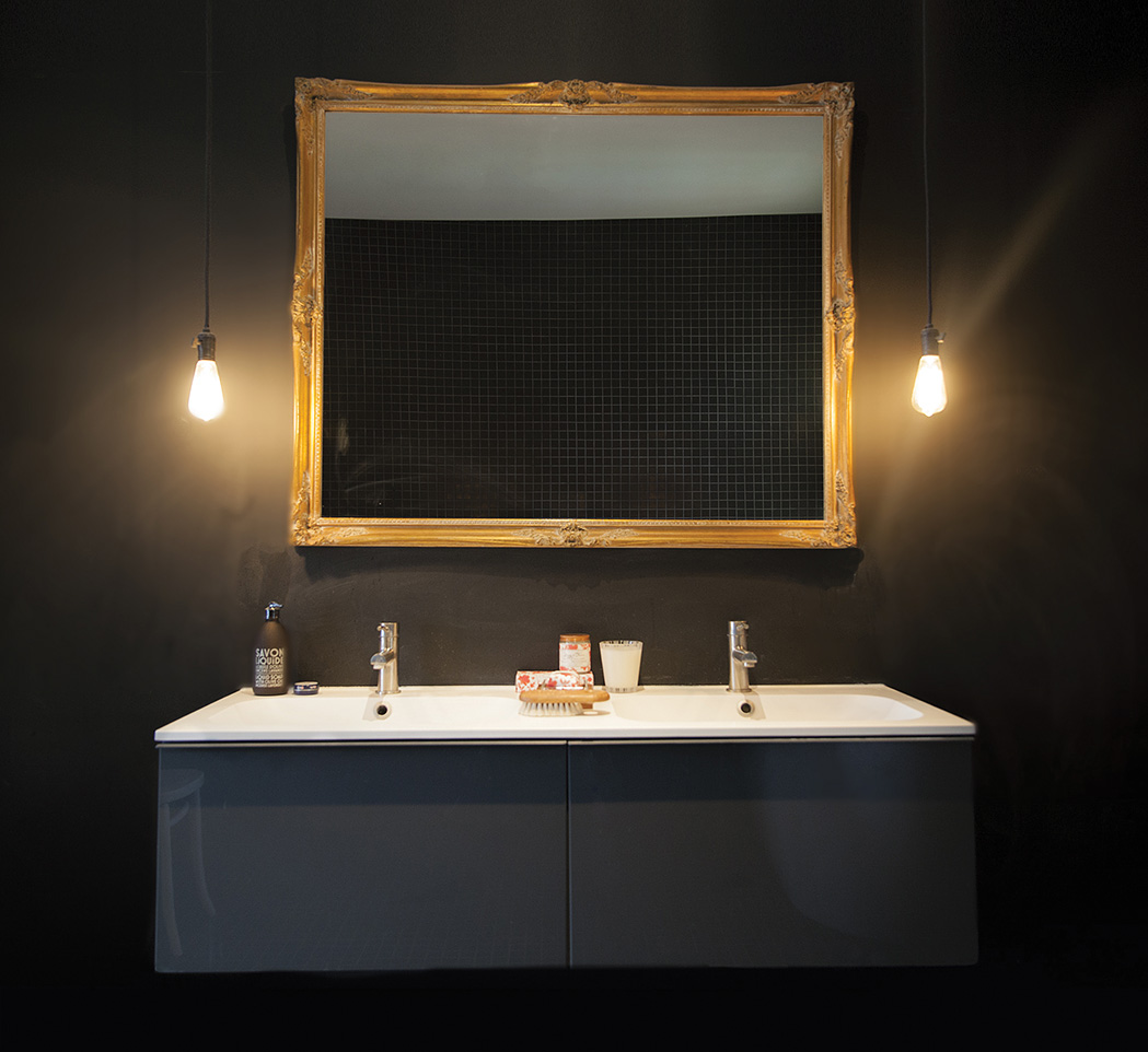
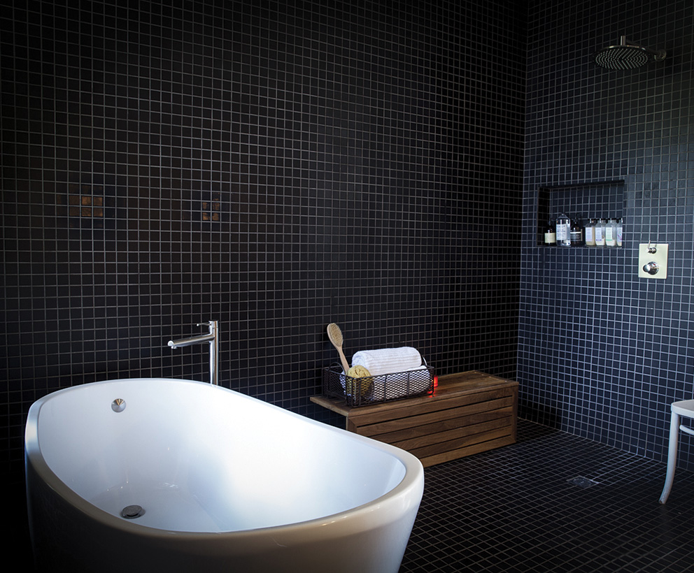
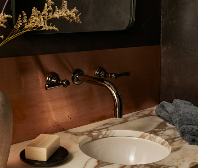
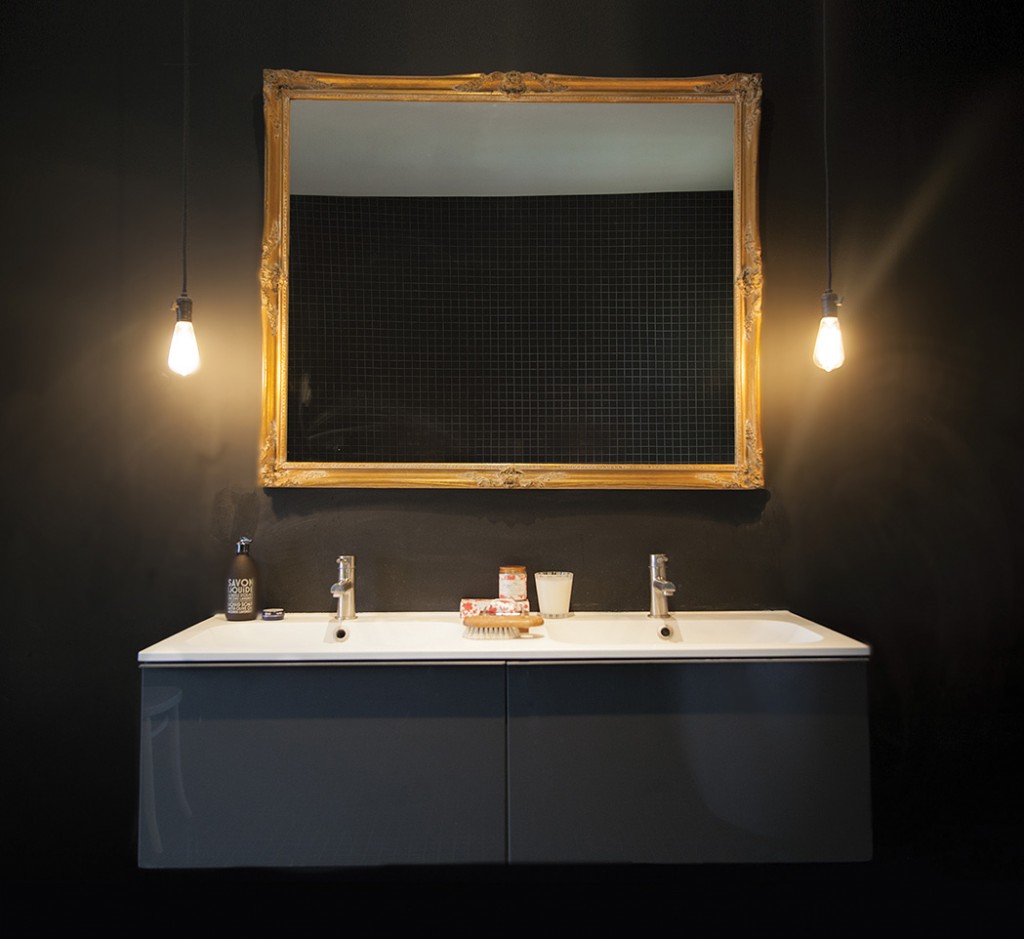
Simplicity rules upstairs. Milne collapsed three small rooms to create a master suite, which flows from bedroom to bath to walk-in closet. By Morgan’s standards, the bedroom is a little bright, but his aesthetic prevails in the bathroom: all black. The entire room, save the chalkboard-paint vanity wall, is clad in two-inch-square black tile.
The result, happily for both, is a draw: For Morgan, a stylish, comfortable home reflecting his passions and tastes. For Milne, a portfolio piece to be proud of. ALISONMILNE.COM
Categories:
Spaces
